
Most multi-location car wash operators do not have a data problem. They have an operating rhythm problem.
The data exists. It is just scattered across too many places: POS reports, payroll exports, labor systems, marketing dashboards, ad spend, spreadsheets, screenshots, and one-off Slack messages asking why a site is up or down.
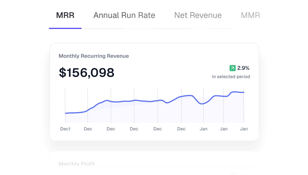
For Day 2 of Shipweek, we are launching KPI Dashboards in Nautilus: live, shareable operating dashboards that bring the business into one view.
One dashboard for every site
Each location should not need its own spreadsheet, report export, or morning screenshot.
With KPI Dashboards, operators can build a view for the metrics that matter, filter it by location and date range, and share a live link for that site. A regional manager can look at one view for every location. A site manager can keep a location-specific view open. Ownership can see the same numbers without waiting for someone to package them up.
That means you can see every location, how each employee is performing on commission, and share a live link for each site — all updating in real time.
POS data, plus the context around it
POS data tells you what happened. It does not always tell you why.
Nautilus KPI Dashboards are built to sit on top of POS activity and pull in the surrounding context: labor hours, labor cost, headcount, paid media, Google Ads, Meta, and other operating systems that explain why performance moved.
That lets a team stop asking separate questions in separate tools:
Did wash volume move because demand changed, staffing changed, or paid spend changed?
and start looking at the full picture in one place.
Built for operators, not static reporting
This is not a PDF report with nicer charts.
Dashboards in Nautilus are meant to be worked in. Cards can be moved and resized. Views can be saved for different roles, sites, and time ranges. Metrics can be opened for deeper analysis instead of staying trapped as a single number.
A KPI card can become a drill-down view. A site rollup can become an employee-level breakdown. A dashboard can become the live screen a team reviews every morning.
Real-time links, not stale exports
The best dashboard is the one everyone can actually use.
Every shared KPI view gets a live link. The recipient does not need to wait for a new spreadsheet when the day changes or a number updates. The view refreshes with the business, so operators can keep the same link pinned, displayed, or sent to the right people.
That matters for multi-site teams. A dashboard should not become stale the moment it is shared.
From reporting to operating
The goal is not to add more charts to Nautilus. The goal is to make the daily operating meeting sharper.
What changed?
Where did it change?
Which site needs attention?
Which employee is driving commission?
Did marketing spend show up in volume?
Is labor keeping pace with demand?
KPI Dashboards turn those questions into a live workspace instead of a reporting scavenger hunt.
This is Day 2 of Shipweek. More tomorrow. ⚓️